
Papa: Design System
About Papa
“Family on demand” start up, Papa, is the leading platform that pairs seniors with “Pals” for companionship and help with everyday tasks. I worked on many projects on both the Papa Pal and Papa Care apps, as well as implemented a design system based on Material UI.

Project Overview
A design system is a collection of reusable components, guided by clear standards, that can be assembled together to build any number of a
pplications. When built and implemented correctly, they enable scale, efficiency, and consistency in design. I created a design system for Papa to implement in a step by step process.
In this project you will see some of the components I built for this design system, but a design system is much more then just a component library. Take a look at what I put together below.
Execution
Each document of the design system is an excerpt from the official Material UI theme file and was updated to match the Papa design. I handed the individual files off to developers so they could build the design system one piece at a time instead of all at once. Each section contains direct links to the MUI documentation for simple access for the developers.
Color:
This sheet displays a base of Papa core color styles. A clear color palette is one of the most important steps of establishing clear design standards that designers and engineers can follow. The core palette creates a foundation that enables consistency across type, components, and graphical elements.

Typography:
I completed an audit of all fonts being used across Papa and found there were many different fonts and styles being used. I simplified the typography into this sheet to define each style from headings to body text to tool tips. This sheet displays all typography styles (size, weight and spacing), updated with the primary Papa font, Avenir LT Pro.

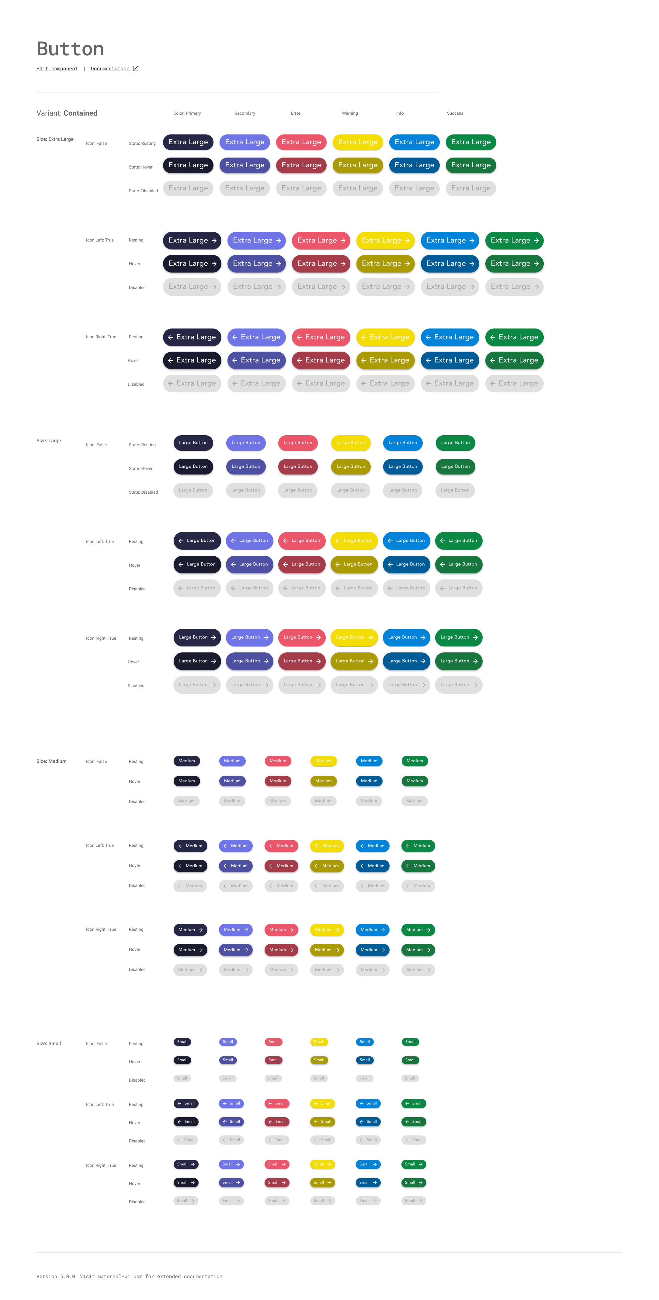
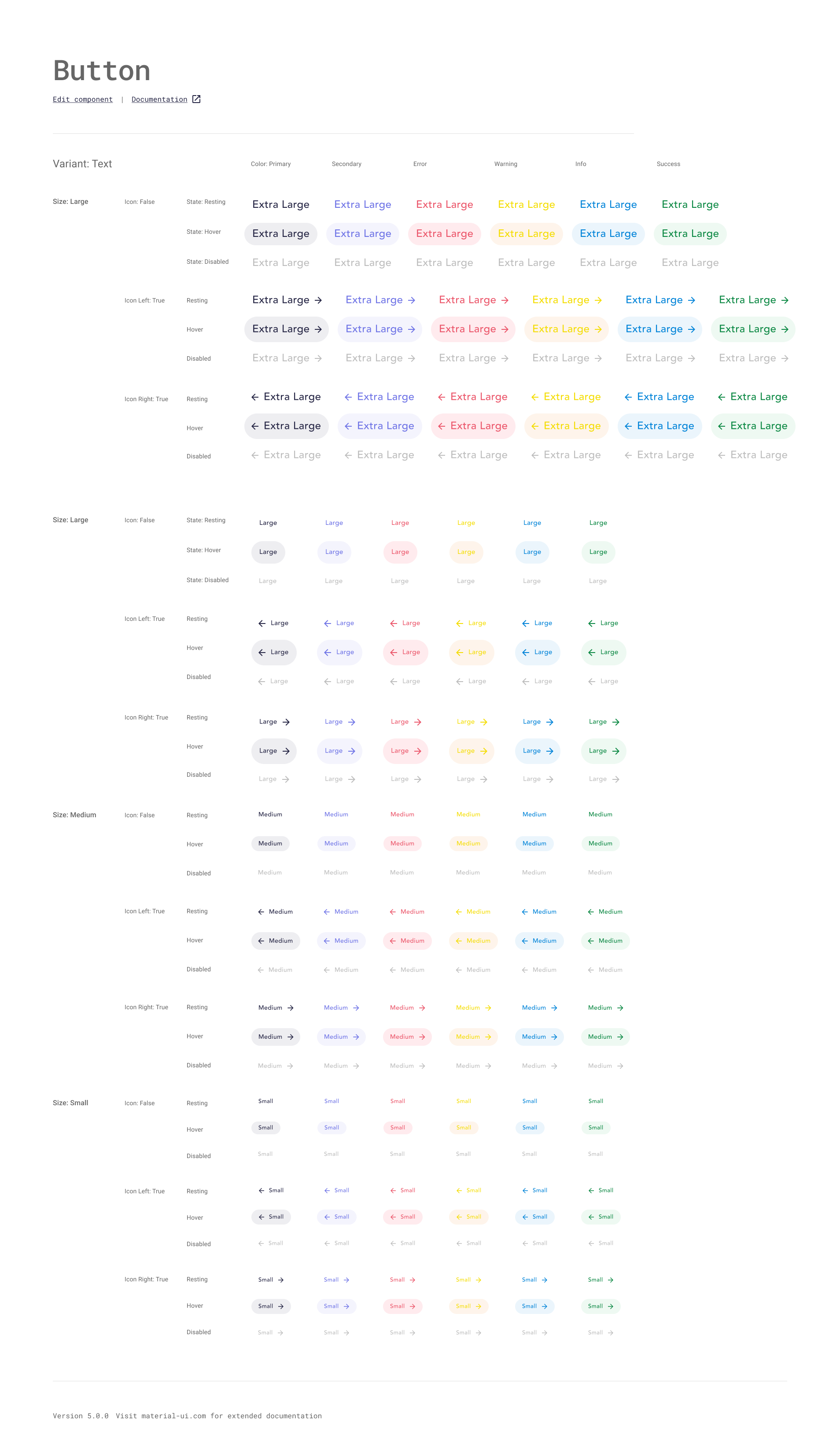
Buttons:
A large category of components I designed for Papa were buttons. Each section of this document has every possible variation of the button: contained, outlined and text. The variants are offered in sizes small, medium, large and extra large and each of these has a dark mode and an icon version associated with them. The Material UI code on the web library includes states of active, hover, focus, and disabled. You can see some of the button variants on the following sheets.

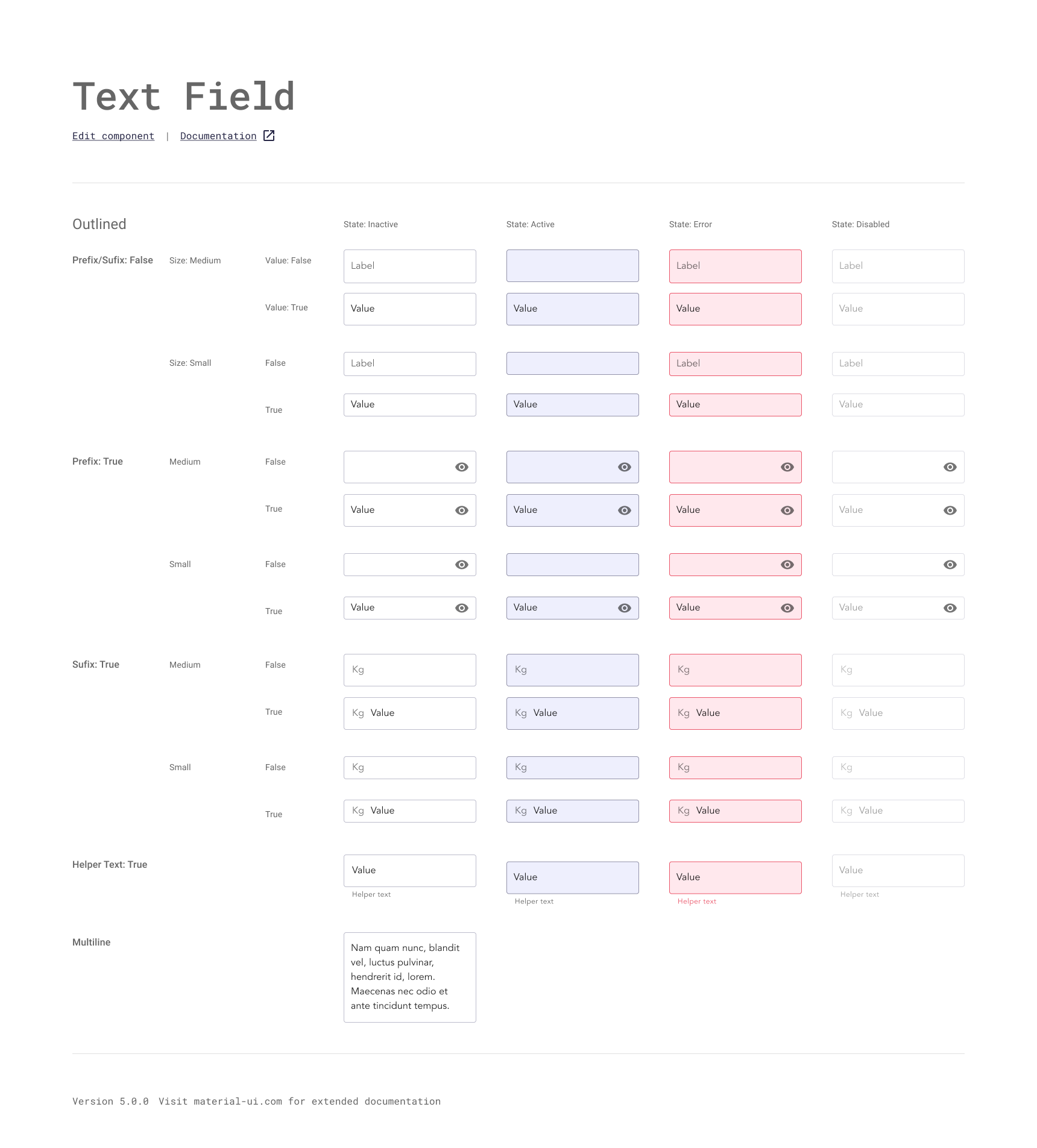
Text fields:
Another large category of components I designed for Papa is Text fields. Similar to buttons, they accommodate several states. One of the most important ideas to keep in mind when designing text fields is accessibility. We tested the fields to make sure the labels are easy to understand and there are clear error states.
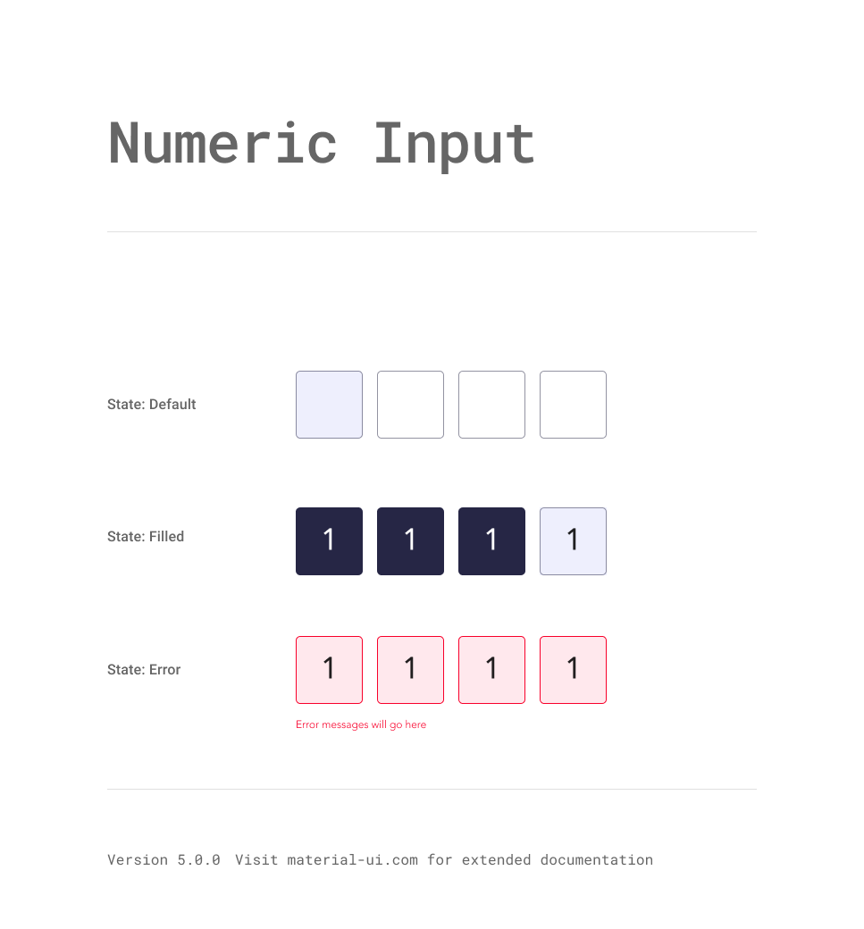
Numeric Input:
These inputs were created from the outlined text field components, using the different states: active, inactive, and error. The filled version is a new type of background created for the numeric inputs.
Results
Design Systems are constantly evolving and growing based on the needs of the team and the products being built. What is shown here is just a sample of what goes into a complete system. A complete design system contains:
Documentation: A shared space where you say when and how to use the design system. See Material UI’s documentation here.
Visual language:
A guide to what the brand feels like.
Pattern library:
Also called "component library" includes what is included above.
Brand guidelines:
Includes principles, tone and voice, writing style, and more.
CSS framework:
Front-end code that developers use to build a product. See an example of the button component’s React framework here.
The Papa design system, as all design systems, is a continued work in progress.
Please reach out for further details ︎︎︎ rachel.collins75@gmail.com
Next Project