
Papa: Member Sign Up Flow
About Papa
“Family on demand” start up, Papa, is the leading platform that pairs seniors with “Pals” for companionship and help with everyday tasks. I worked on many projects on both the Papa Pal and Papa Care apps, as well as implemented a design system based on Material UI.


Project Overview

Papa was primarily offered through health care providers, like Medicare, Medicaid and Humana. Starting in 2022, a new avenue for members to access care from Papa Pals opened through their employer benefit. I worked on designing the sign up flow for this emerging market segment of Papa users: members signing up through their employer.
Papa offers a unique type of benefit for employers—high-quality, human help and companionship to promote the well-being of employees and their families from our friendly Papa Pals.

Objective
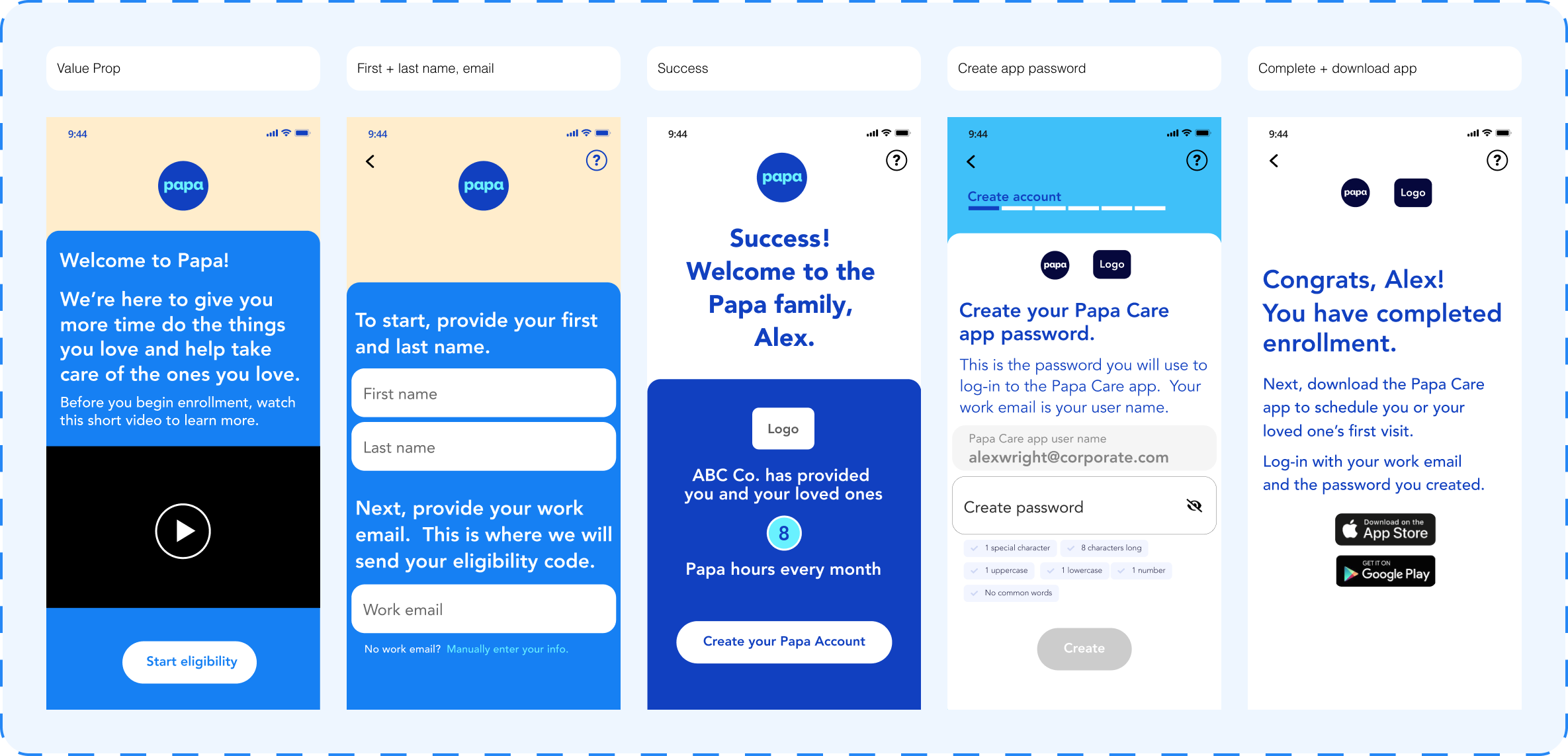
Design a web based sign up flow for users enrolling for Papa through their employer benefit.
Requirements + Wireframes
I worked closely with product leadership to gather initial requirements of the flow in order to design a task analysis and first round of wireframes.

Research
From the wireframes, I designed a first pass at the flow and set up user testing to gather initial feedback. We asked questions on general usability, comprehension, and level of comfort providing different types of data. However, the main question we were looking to answer from the testing is how do we quickly and seamlessly gather information from a user? To find the best solution, we created two versions of the wireframe flows:
- Long form: asking multiple questions on one screen
- Short form: asking questions individually
Here are screens from the two early versions we tested, the long versus short form flow:

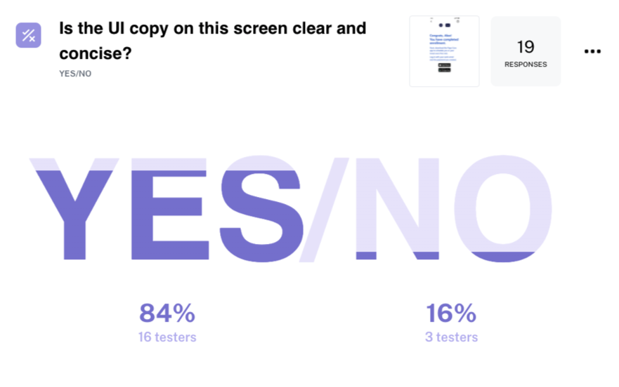
I used the user testing software, Maze, to set up, launch, and analyze results from the test. Gathering feedback from user testing early in the process was key to pinpointing weaknesses in the initial designs and addressing internal biases.


Evolution
After the user testing, I incorporated targeted feedback into the sign up flow. The short form test was highly preferred and I shifted from a video intro to sliding images for the value prop. I also began to incorporate Papa branding elements like simple illustrations and the wavy line.

Results
I worked closely with fellow designers, researchers, developers and product managers throughout the design + development phases. We were able to complete the sign up flow from scratch within our deadline.
Average time to complete the sign up flow based on usage data: under 2 minutes

Flow Map

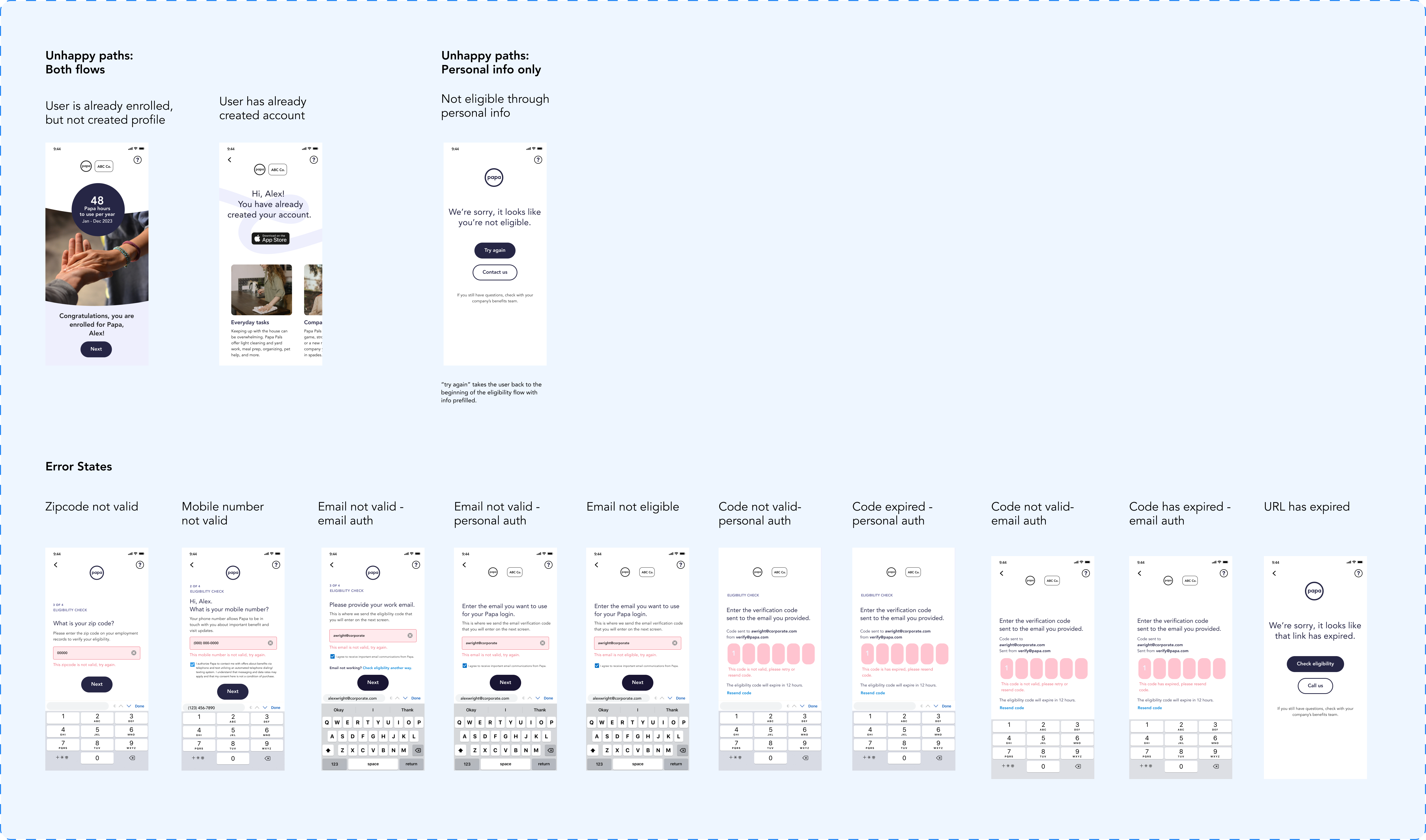
Error States and Unhappy Paths
More information about Papa for employers ︎︎︎ here
Please reach out for further details ︎︎︎ rachel.collins75@gmail.com
Next Project